

Today, I’m diving into how I got AI-powered data visualization to work in an incredibly flexible way inside shellA. Stick around because I’ll show you how I avoided the messy stuff like dealing with iframes and external rendering hacks, and instead ended up with a 30-line PR.
The Problem
Users can create workflows. Those workflows often end in data, currently exported as spreadsheets, which is great. But often, we just want to see the result. Sure, we could generate an SVG as the final step in a workflow, but that’s still not ideal. We wanted something more dynamic, embedded, and automatic.
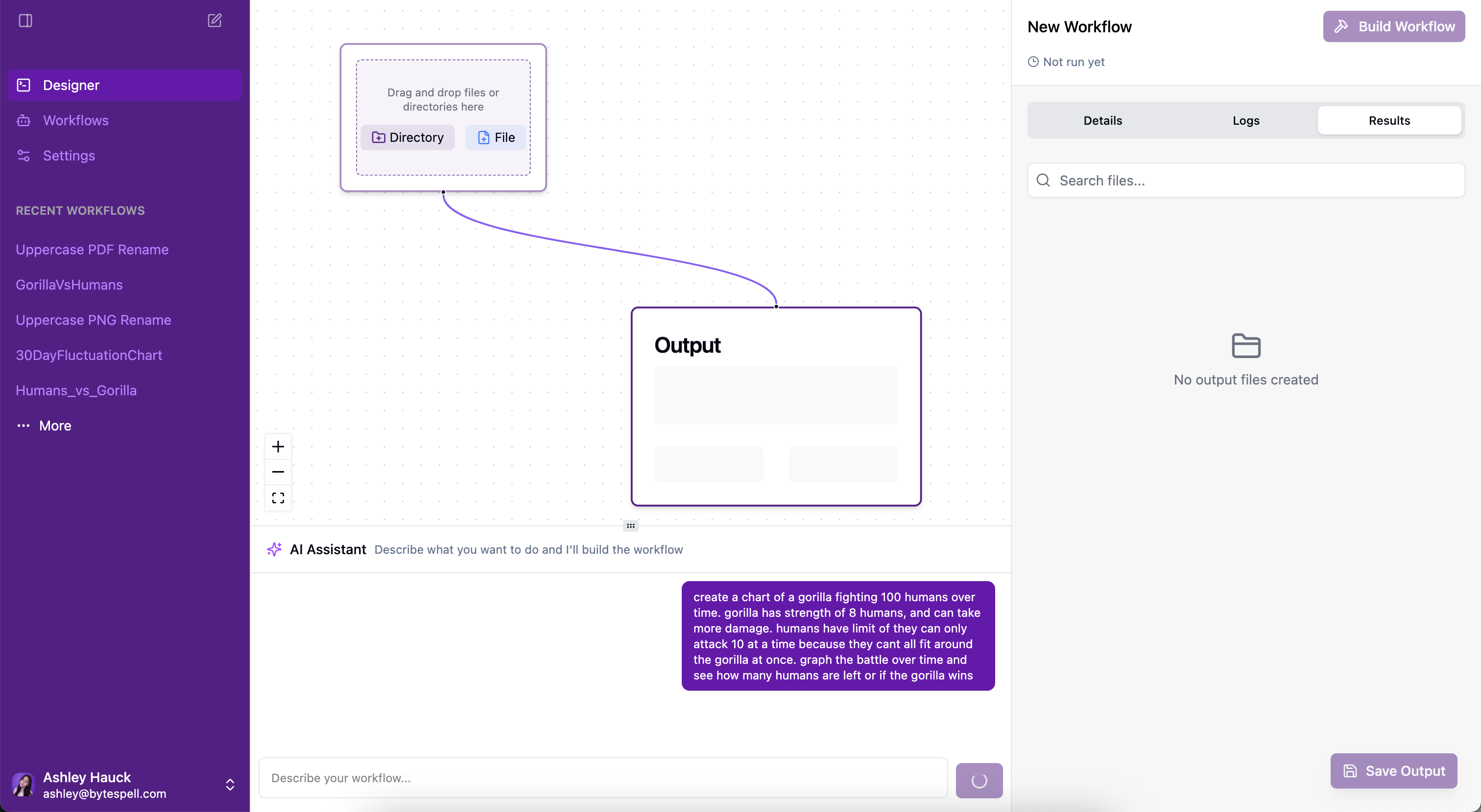
For example: “1 silverback gorilla vs 100 men, how does the fight go?” I want to see the battle over time. I want charts. In the app. Dynamically.
The challenge: we need to be able to sometimes render charts, based on unpredictable, user-generated data. And I don’t want users defining chart configs. They’re not here to engineer anything, they’re here to use the software.
Rendering Options
- DOM rendering: Could I use
dangerouslySetInnerHTML? Ask users to return a full HTML page? Maybe. Feels messy. But the upside is I could use any JavaScript charting library. - Iframe: I could generate a full DOM and embed it in an
<iframe>. But I have not ONCE had a good experience with iframes. Hard pass. - File by saving PNG: Easiest to prototype. I actually got a basic POC working fast. But the UX is not good. Users have to leave the app. I could try rendering it back into an
<img>tag creatively, but that’s a last resort.
So, DOM rendering it is. Time to explore chart libraries.
D3 is the OG of data viz. Launched in 2011. I can’t believe I’m still writing about it in 2025. But D3 isn’t really a charting library, it’s a DOM-manipulation toolkit for data. It’s absurdly powerful and incredibly low-level.
You’re working close to the DOM. You’ll be manually writing <svg> tags, building scales, axes, and animations yourself. It gives you full control, but that means building everything from scratch. Great if you’re doing custom, interactive stuff, or building your own chart library. But overkill here.
This is my current go-to. I’ve used it with success before and it’s built for React. It uses real components instead of JSON config. You get a super declarative, composable way to build clean charts quickly.
Bonus: it’s used under the hood by shadCN, so it dropped into my stack beautifully.
But composability is also the problem here. How do I generate a React component tree if I don’t even know what the user is trying to visualize? I don’t want the user fiddling with chart configs, and I definitely don’t want to try generating JSX dynamically. So even though I love Recharts… not this time.
Enter Chart.js. Another old one, 2013. And fun fact: Tanner Linsley of TanStack fame maintained it back in 2016.
Unlike the others, this one uses
And here’s why it wins: I can just generate a JSON config at the end of the workflow and hand it off to the frontend. No React tree. No iframe. No user config.
Implementation
Chart.js it is.
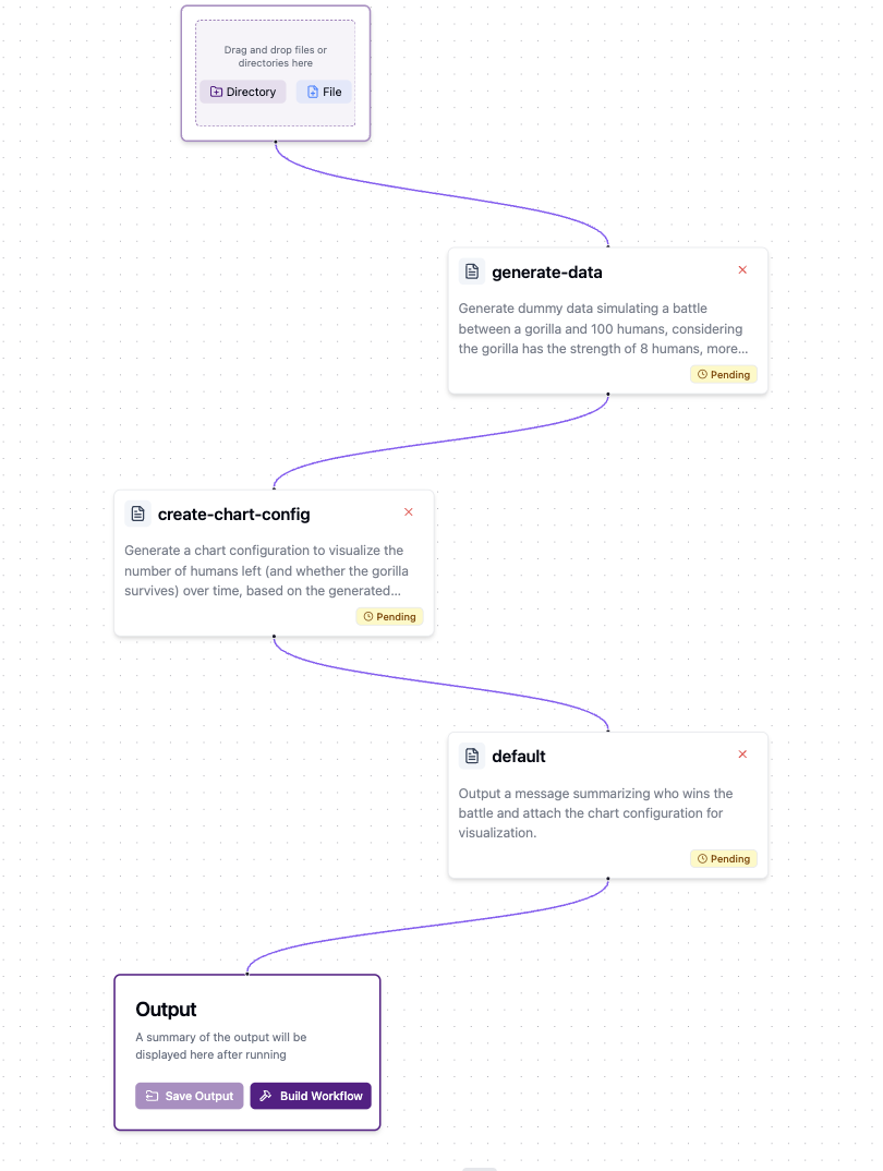
When a user runs the “Gorilla vs 100 Men” workflow, we generate a valid Chart.js config as the final output. It was only a few lines of code in the core workflow logic to wire this up.
Then I just passed it through our existing IPC system, added a check on the frontend for whether this chart config exists, and created a little React component to render the chart using Chart.js.
Done. It just works. Only renders when the chart exists. Feels like magic.
The Result
This was absurdly easy to implement. After four hours of research and zero lines of code, I basically “one-shot” the solution in a 30-line PR. I don’t usually engineer this way. I prototype a lot. But this time, I just researched hard, and the result was so clean it didn’t need iteration.
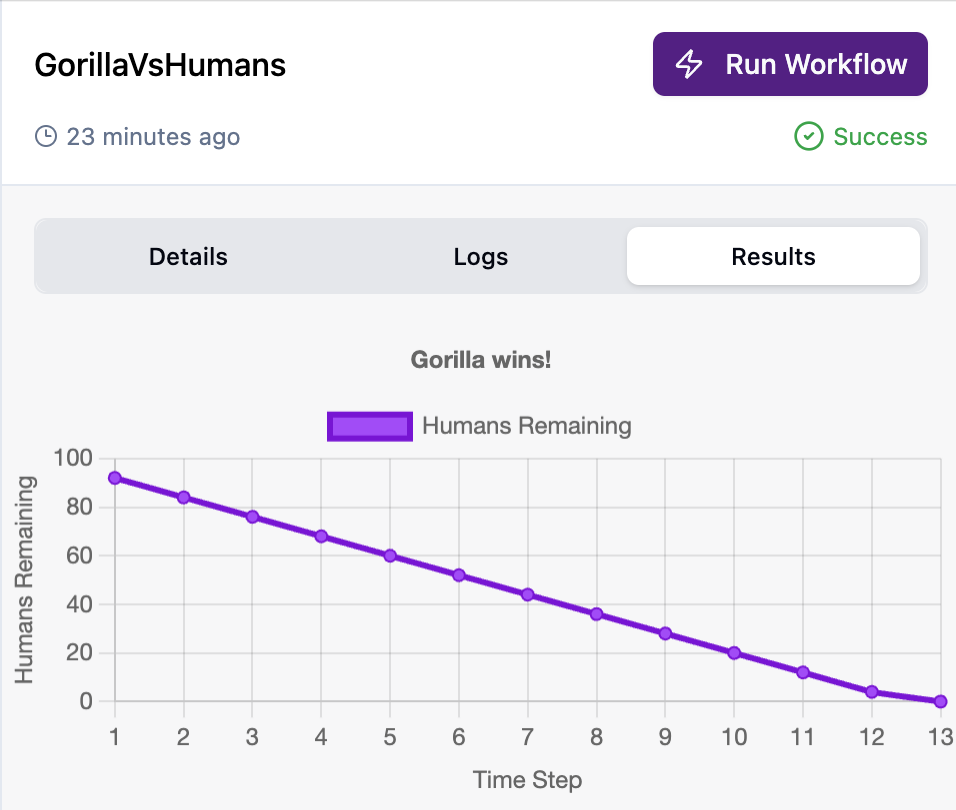
Let’s run the gorilla workflow now and watch the chart render in real time.
Want to try it? Jump into shellA and build your first chart-generating workflow, no setup, no config, just charts.